
Vehicle Navigation
The current vehicle navigation is a mess and does not inform the user of their options in the best way. To discover current pain points and create improved opportunities, I conducted observational user testing, analyzed results, offered UX/UI solutions, and presented the research results and design evolution.
Project overview
Initiative & goals
As a UX team we studied our vehicle navigation in comparison to our competitors and popular brands.
Our goal in mind was to learn which different layouts and flows users understand and feel the most confident operating.
To help us determine user behaviors and success rates, participants navigate through eight brands, two tasks on each, where we measured their levels of confidence, rates of task completion, and formed behavioral patterns.
Actions & process
My part of the project included observational user testing, analyzed results, presented test results, and navigation UX/UI redesign.
We gathered 21 participants to observe their navigation behaviors through user testing.
Conclude quantitive and qualitative analyzes of test results
Redesign layout, structure, interaction, and visual presentation based on the successes of our competitors and user feedback.
Results
Clean UI and with of added white space to drive user focus
Simplified navigation
Easy access to view entire line up
Designed for user success
Included levels of drawers giving user an understanding of what space they are located in
Added vehicle description to help the user learn what series they are engaging with
Current designs
Mobile
The current designs face a few visual struggles. The mobile versions have drawers within drawers within drawers making it overwhelming to consume and difficult to make a decision.
Desktop display has a different issue, that being the amount of vehicles showed. This layout only allows four to be shown presenting the thought that only four models exist even thougheach category of motorcycles has multiple models available.

Desktop

Testing competitive sites
Test purpose
Objective
Learn which different layouts and flows users understand and feel the most confident operating
Process
Participants navigated through set tasks between eight brand’s sites with two scenarios on each
Use navigation
Participants
Gathered 21 participants to observe their navigation behaviors
Measurements
To determine user behaviors and success rates, measured their levels of confidence, rates of task completion, and formed behavioral patterns
Takeaways
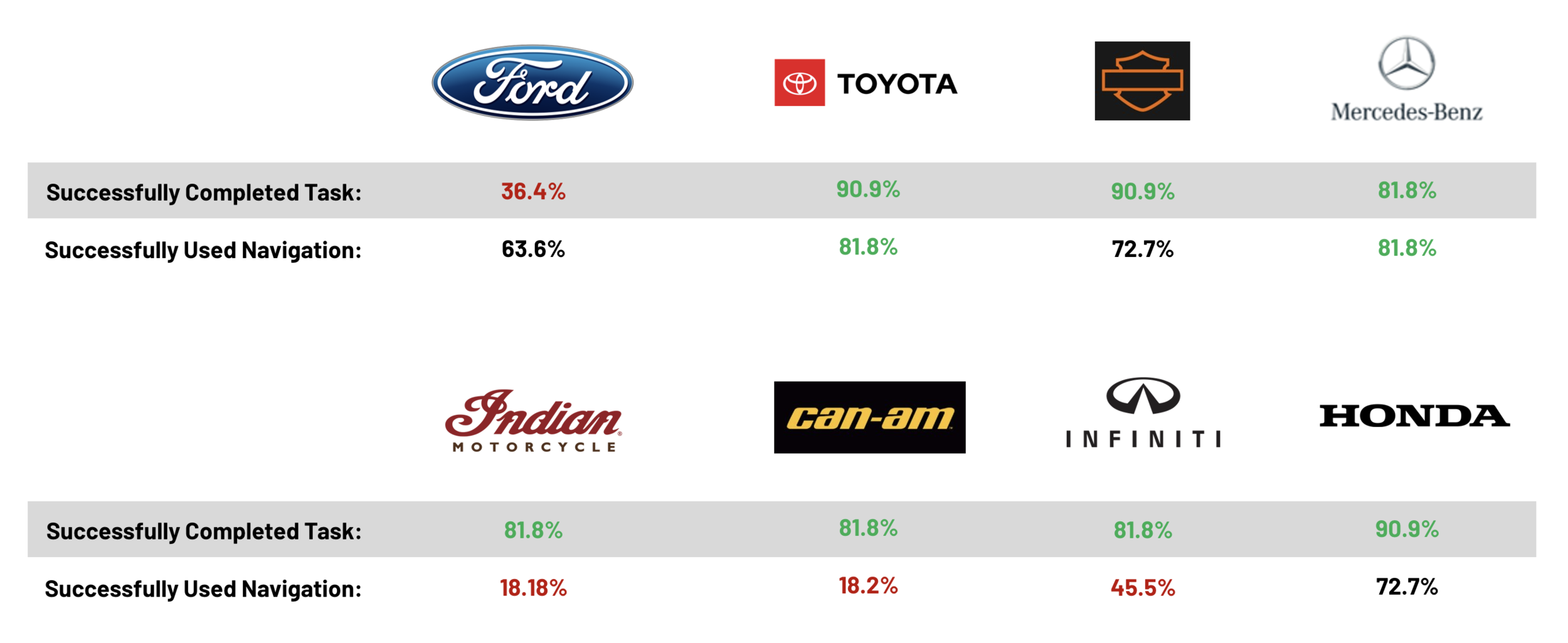
70% of participants used the navigation
56% of participants used navigation & successfully completed task
Identified 3 Types of Users: Those who DO use the navigation, DO NOT use the navigation, and partially DOES and DOESN’T
Toyota, Harley Davidson, Mercedes & Honda all had the highest success rates
New-to-market participants consistently struggled with brand specific verbiage (new shoppers don’t relate to rider lingo). This was seen across many of the brands but observed this pattern the most with Harley Davidson and Indian Motorcycles
Identified user types
Confidently refers to the menu
Look for high level categories and navigate down towards defined sections to filter to their desired location
Complete the task very quickly
Typically, successfully complete the task
Don’t use navigation
First instinct is to begin scrolling on the homepage and look for call outs that relate to the task at hand
Navigate through featured elements such as carousels and promotional CTAs
Typically travel between family pages and model pages
Participants scroll for most of their experience
Typically, never consider using the menu navigation
Hybrid navigation usage
At times, participants start with the menu and navigate to an 'All Vehicles' type page then filter down their options on that page to find their desired location.
Noticed this behavior when users begin navigating through the menu but get lost or confused on how to move further through the menu.
Test results
Successful navigation layouts
Toyota
Participant confidence: Easy (10%), Very easy (90%)

Common behaviors
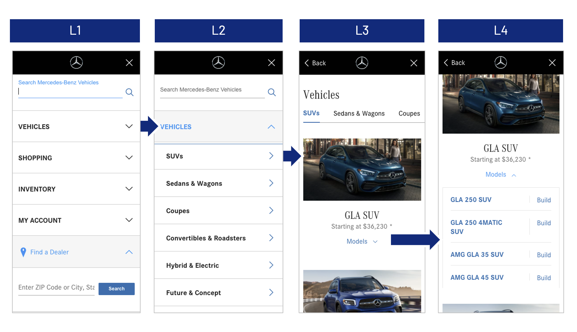
Participants felt they were brought to a model page to view all vehicles, when they were still in the menu
Scroll-first action percentage: 9.1%
Common behaviors
Several participants did NOT see the 'Models' drop down on level 4 of the pages
Participants liked the horizontal advancement on navigation paired with the vertical scroll.
Wanted 'All Vehicles' link to be closer to top.
Scroll-first action percentage: 9.1%
Design patterns
List-based format
Minimal scrolling
Image-base vertical scroll
Feels like a separate page
Mercedes
Participant confidence: Neutral (4.5%), Easy (9.1%), Very easy (86.4%)
Design patterns
List-based format
Minimal scrolling
Image-base vertical scroll
Feels like a separate page
Undesirable navigation layouts
Indian Motorcycles
Participant confidence: Difficult (15%), Neutral (15%), Easy (25%), Very easy (45%)

Can Am

Common behaviors
Participants often scroll through vehicle carousel to find a specific model
Often searched through each category in the menu looking for a specific model
New to market participants had a low level of confidence – they did not know how a vehicle would be categorized
Many participants found the 'Explore Vehicle Lineup' button on homepage
Participant confidence: Easy (47%), Very easy (47%)
Common behaviors
Participants often scroll first to view promos on the homepage
Many participants found the "Discover 2021 Lineup" button on homepage
Typically, when asked to find a specific model they navigated through the homepage
When asked to find the all vehicles line up, participants more often referred to the menu to navigate
Design patterns
List-based format with dropdowns
Vertical open and scrolling on top of vertical open and scrolling on top of vertical open and scrolling
Design patterns
List-based format
Navigation links directly to lineup page
Key design patterns
Based on the noted participant observations, successful journey completion rates, and user feedback formulated the following design suggestions.
Consider
Clean and minimalistic UI (Mercedes & Toyota)
No logo on deeper drawer levels
Make selection states feel light and airy
Menu with few listed options (Mercedes, Toyota, Infiniti, & Honda)
Subcategory horizontal navigation (Mercedes, Can-Am, & Infiniti)
Drawers leads to models that acts as a model page (Toyota)
Create clear access point to view all vehicles
Bringing "All Vehicles" towards top of display
Smaller vehicle images and more white space
Avoid
Market language (Harley-Davidson & Indian Motorcycle)
Flashy homepage (Can-Am)
No clear access to view all vehicles in the menu (Honda)
If goal is to get user to use the menu – Starting homepage with an interactive element (Indian Motorcycles)
Rough drafts
Mobile


Desktop


Finalized solution
Following what was learned from the research, these designs incorporate aspects that helped users get to their destination in the easiest manner. The mobile format follows Toyota’s structure of multiple drawer levels. Toyota also excelled in their UI. Their use of clean, minimal design allowed for users to digest the page and move from point A to point B effortlessly.
Mobile
Our updated navigation features a clean and airy UI, offers fewer drawer options to provide an easier opportunity to make confident decisions, displays all vehicles at once, and easy access to view the entire line up. All these aspects aided in test participants completing their flow confidently.

Desktop
Desktop, obviously, has more space and opportunity in layouts. Here, was strived for clean modern UI that offers all vehicles to view at that level. Once the user opens the “Motorcycle” drawer, they are shown model series that they can tab through, scroll to expose all options while the menu to the left stays static.
